I've finally launched my new website! It's got a whole new look, includes tons of new illustration, fine art & design work—and the new format will be much easier for me to make regular updates. Plus, I've integrated my blog with the new site so you can find everything here:
Please be sure to bookmark and subscribe to my feed there to continue to get updates on my blog. I'll no longer be posting to this blogspot page.
I'm hoping to tweak a few things about my new site design over the next few months—but do take a look and feel free to let me know your thoughts!
Also, I've recently (or more like finally!) joined the social media world! :)
I've launched a Facebook page for my illustration work, and you can follow me on Twitter too, @jeaninehender.
In the meantime, I've just gotten 2 big, super exciting jobs that I'm diving into! I'm illustrating covers for a 3-book series for Penguin, and also hand-drawing type & designing an awesome lead title for Sourcebooks. So, I may be a bit sporadic with updates over the next few busy weeks, but can't wait until I'm able to share more details about these projects!
Showing posts with label illustration. Show all posts
Showing posts with label illustration. Show all posts
Tuesday, May 24
Thursday, May 19
Licensing workshop and Surtex/Stationary Show
Last weekend I took Cheryl Phelps' art licensing workshop in NYC. Cheryl is pretty much a guru in the world of licensing and greeting cards—and I had always heard that she was an incredible speaker. I'm so happy I took it; She shared an insane amount of helpful information about getting started in the industry and marketing your work for product/packaging usage, and I left feeling super inspired.
In the last few years—as I've listened to feedback on my work from art directors—I've begun to realize the potential life my style could have in the licensing world, but was kind of overwhelmed at the sheer idea of getting into it. Seems so vast and foreign—I didn't know where to even begin to look for more information about how to get started. So, this was a perfect intro for me. She shared info, tips, and even contacts—and all in such a clear, non-intimidating way. I definitely have some ideas now about how to gear my work toward this, and who I want to work with in this market.
The workshop also coincided with the Surtex and National Stationary Shows in NYC. I'd always heard that these are the shows to be in as a licensing artist, but I never actually fully understood how it all worked or what it was all about. So, the day after the workshop I stopped by the Javitz Center to check it out, and now really have a much fuller sense of the industry as a whole. I definitely would like to make a real plan to begin to persue the field over the course of the next year—and see if I can add licensing/product illustration & greeting cards/stationary to my resume in the near future!
Sunday, April 24
The Juggler, Take 2
Here's the digital version:

I've tried to compliment the colors and textures I used in my previous Acrobat and Fire Eater pieces. I've gotten a nice response to this series, and plan to use it in self-promotion as well as creating a set of notecards that I could sell on Etsy. I may even add a 4th image to complete the set...Stay tuned!

Wednesday, April 20
The Juggler


I was recently invite to contribute a piece of art for PS 39's upcoming 2nd Annual Spring Carnival. PS 39 is a small, public elementary school in Park Slope Brooklyn facing substantial budget cuts, which will result in the loss of their arts & music and physical educational programs. All money raised at the event—and from the silent auction of all art donated—will go towards sustaining these programs.
Not only was this another great opportunity to contribute to a really good cause—but also super fun, as it was a totally open call to interpretation of a "circus" or "carnival" theme. (Any of you following me know this is one of my favorite subjects! :) The only guidelines were to create the art on a provided piece of 16" x 16"- 1/4" plywood. I've always wanted to experiment with wood surfaces, and tried to experiment also a bit with mediums; I mixed acrylic washes and pen & ink and gold leaf accents, and worked in a fairly quick manner.
I'm going to translate the drawing as a digital personal piece as well, to become a companion to the Acrobat and Fire Eater that I've recently added to my portfolio.

Tuesday, April 12
Illustrations for feature article in Cleveland Magazine

I recently had a super fun opportunity to illustrate a feature article for Cleveland Magazine. The April issue highlights the favorite hangouts of 5 local Cleveland celebrities. Everything from the hottest nightclubs, to the trendiest shops, to the city's best eats are included in "The City List". So it was also a unique opportunity for me to get the inside scoop on this cool town!
The art director, Kristen Miller, was really great to work with and had a very cool vision for the format. They photoshot each celebrity, and I created "mind maps" of all the attractions mentioned in the article. These "mind maps" were made up of icons representing the attractions and hand-lettered quotes offering up fun tidbits about what these celebrities love most about their city. So, I got to really dive into researching—which is always a part of the process I love—and was able to use a combination of drawing, lettering, and design to make these images work together, while also integrating with the photographs, to create an informative visual for the article.
I had a lot of creative freedom with this, which always makes a project extra fun. And with 5 full-page spreads to fill, I got to draw so many different, cool things! Plus, really feel like I got to know Cleveland on a personal level—now I might just have to plan a visit! :)
You can also check out the full article & spreads in the online magazine.


Thursday, March 31
Art Love Japan
The recent disasters in Japan have touched all of us; As humans we can only feel an overwhelming feeling of sympathy and heartbreak for all the people who have lost loved ones, homes, livelihoods...everything they had and knew. Yet, as a single being on the other side of the world there's also a sense of helplessness about what we can really do to make a difference. But, I think every little bit counts, and I've been inspired by some friends who have responded by using their talents to create art for sale and offering up the proceeds to relief efforts.
Manjari Sharma—a dear friend and amazing photographer—just created a gorgeous limited edition print entitiled "Hope" that was sold through Wall Space Gallery and benefited 2 charities aiding the Japanese in need. Tara Jacoby—a friend and super talented emerging illustrator—created a really beautiful piece that she's selling prints of and donating all proceeds to the Red Cross. So, when I saw the call for entries for Art Love Japan, I was super excited to have my own chance to create something for the cause.
Art Love Japan is a charity art show/event at In Rivers Gallery in Brooklyn, New York. Anyone can participate by sending in a small 5"x8" work of art inspired by the theme of love, hope and happiness. All original works will be sold for $20 and buyers will have the choice of 3 charities to donate the proceeds to.
The exhibit opens Friday April 8 and will only show for 3 days at In Rivers Art Gallery in Greenpoint, Brooklyn. Full details about the project and exhibit can be found on the website or facebook page.
Every April, my street becomes a beautiful promenade of pink petals and the air becomes filled with a sweet, delicious smell as the Japanese cherry trees lining the perimeter of the Brooklyn Botanical Garden begin to blossom. I love this time and these trees, and so I felt inspired to use such a beautiful cultural symbol to convey my sense of love and hope for Japan in my piece. As I was researching, I learned exactly what the cherry blossoms symbolize to the Japanese people: The fragility and ephemeral nature of life. That fragility has been exemplified in Japan more than ever over this last month—so it seemed the perfect subject matter to base an image off of. Here's the piece I created and am donating to the exhibit:

I really enjoyed creating this. There wasn't much time from the call for submissions to deadline for this project, so I tried to keep it simple and experimented a bit with style and medium. I found a cool paper laying around my studio—almost like an oak tag stock—and used ink and water color & liquid acrylic washes to just add minimal color. It was a fun, fresh way for me to work a bit differently from both my heavily textured paintings and my flat, digital art.
I'll be at the exhibit next Friday—if you are in the NYC area come check it out, buy some affordable art—and support a great cause!
Thursday, January 27
Yay 2011!
Happy New Year to all!
I'm a little late catching up with my blogging—2011 has already been off to a very fast-paced, busy start!
I'm full of inspiration and exciting new ideas for this year including some plans to begin to sell some products and prints featuring my art, as well as branch out to some new markets with both my design and illustration work. But—first project in the works: relaunching my website with a brand-new look! Keep an eye out for that soon.
In the meantime, I've been working with some new publishing clients on some book cover projects. I can't share those for awhile, but it's been great to start the year with some new relationships.
I also finished up my sketchbook for the Arthouse Co-op's The Sketchbook Project. The touring national exhibit begins next month at The Brooklyn Art Library in Williamsburg, with a reception on February 19th. From there, the sketchbook collection will exhibit in 9 different US cities through July of this year, including stops in Chicago, Austin, San Francisco, Washington, D.C. and more! Over 28,000 artist participated in this project so definitely keep an eye out for the exhibit in a city near you! (Schedule is on the Arthouse Co-op website)
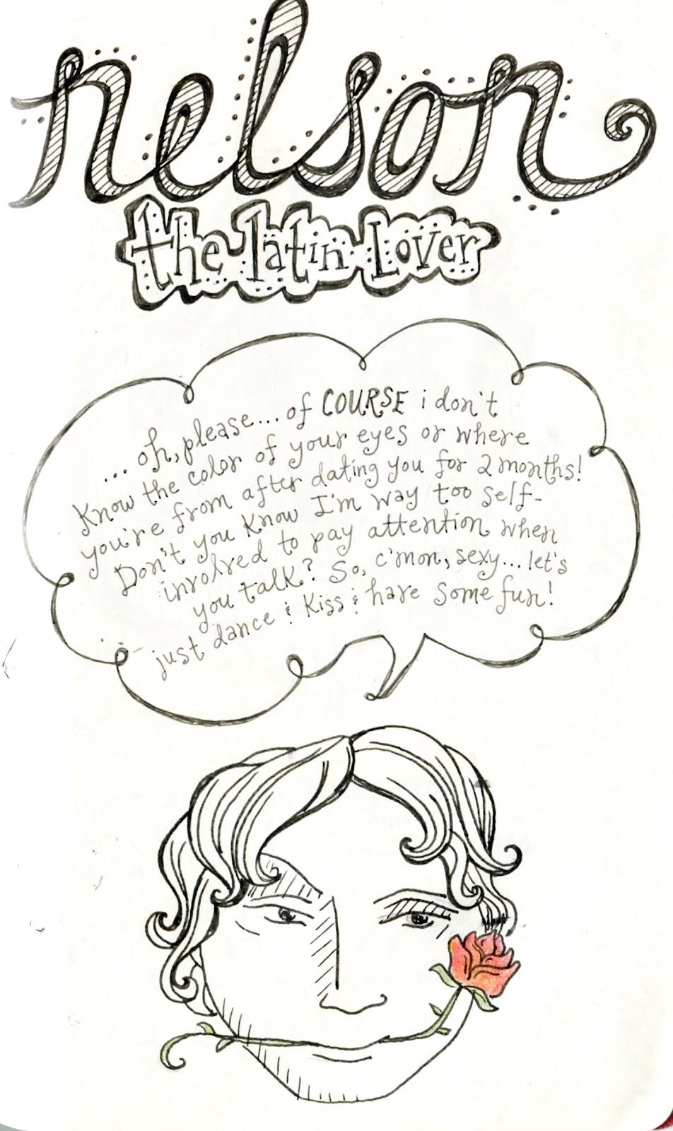
Here are a few of my last pages from "Great hopes and Massive Failures" (a.k.a. a visual diary of my years as a single woman in New York City's sometimes vicious, sometimes hilarious, dating scene!) I had a blast with this project, and even found myself inspired to keep some other ongoing theme-based sketchbooks...which I'll share some of soon!


I'm a little late catching up with my blogging—2011 has already been off to a very fast-paced, busy start!
I'm full of inspiration and exciting new ideas for this year including some plans to begin to sell some products and prints featuring my art, as well as branch out to some new markets with both my design and illustration work. But—first project in the works: relaunching my website with a brand-new look! Keep an eye out for that soon.
In the meantime, I've been working with some new publishing clients on some book cover projects. I can't share those for awhile, but it's been great to start the year with some new relationships.
I also finished up my sketchbook for the Arthouse Co-op's The Sketchbook Project. The touring national exhibit begins next month at The Brooklyn Art Library in Williamsburg, with a reception on February 19th. From there, the sketchbook collection will exhibit in 9 different US cities through July of this year, including stops in Chicago, Austin, San Francisco, Washington, D.C. and more! Over 28,000 artist participated in this project so definitely keep an eye out for the exhibit in a city near you! (Schedule is on the Arthouse Co-op website)
Here are a few of my last pages from "Great hopes and Massive Failures" (a.k.a. a visual diary of my years as a single woman in New York City's sometimes vicious, sometimes hilarious, dating scene!) I had a blast with this project, and even found myself inspired to keep some other ongoing theme-based sketchbooks...which I'll share some of soon!


Tuesday, December 21
Happy Holidays!
I'm very excited that I had the opportunity to illustrate and design Puffin Books' holiday card. It was a fun little piece that also allowed for some hand-lettering, and will be sent to many of the talent artists and authors who work with Penguin.
I'm off for an amazing holiday adventure to Colorado and Hawaii--so sure to have lots of inspiration to start off a new, productive year! In the meantime,
Happy holidays to everyone, and all the best for a happy and healthy 2011!

Saturday, December 18
More Sketchbook Project
Just sharing more of my progress with the Sketchbook Project.
My theme is "Great Hopes and Massive Failures" and this title is, for me, an opportunity to tell some of the funny (well, mostly funny!) stories from my past life in the NYC singles/dating world.
I'm really enjoying just getting to experiment a bit with composition & design—and lots of hand-lettering—to tell the stories and represent these characters from my life in interesting ways.


Monday, November 29
Blog Illustrations for "Secret Lives of the Unemployed"
I was recently asked to illustrate a fun story on a cool short-fiction blog, by writer Elizabeth Bartucci, that chronicles three Brooklyn neighbors, who after a year of being unemployed stop looking for work and embrace their lives of permanent hooky.
I created 3 pieces to accompany the post "Strap of a Jock", a humorous glimpse of a neurotic woman's traumatic wash-n-fold laundry experience. This entry made me laugh out loud, and I really had fun making the art! Here are the finished images, and the full story can be read at Secret Lives of the Unemployed.


Monday, November 1
Commissioned art
A dear friend of mine got married recently, and I was honored to have the opportunity to create 2 illustrations for her. The first was a portrait of the bride and groom, used for her save-the-date card. The other is an image of the venue she had her reception; she created small prints of this give to each of her guests as the favors.
These were extra-special projects as it's wonderful to be able to create something for a good friend!


These were extra-special projects as it's wonderful to be able to create something for a good friend!


Sunday, October 17
Illustration Friday-Spooky
Just re-posting an image I made for a gallery show awhile back, inspired by the Mexican holiday, Día de los Muertos...or Day of the Dead. I felt that it fits this week's Illustration Friday theme: Spooky.
This image can be purchase as a print through Charmingwall Gallery: http://www.charmingwall.com/

This image can be purchase as a print through Charmingwall Gallery: http://www.charmingwall.com/

Wednesday, September 22
Illustration Friday--Acrobat
I haven't participated in Illustration Friday for awhile, but I couldn't pass up this week's topic: Acrobat.

Halloween is right around the corner, so of course I've been conjuring up my costume visions for awhile now. Friends and I are making circus-themed costumes, so I've spent the last few weeks referencing endless images for inspiration, and acrobat visuals have definitely been living in my brain....
But even more relative is the flying trapeze class I took a few weeks ago! That's right-I actually got to be an acrobat—flying through the air, just like in the circus! :) It really was an incredibly exciting, exhilarating experience! (I highly recommend trying it!)
So--how could I possibly pass up an opportunity to create this little acrobat image? I love making art that so directly reflects my life!
Saturday, September 11
New piece
Today was one of the first Saturdays in a very long time that I haven't been bogged down with a looming deadline for a project or some kind of social obligation; It was also a beautiful, breezy day with a twinge of fall in the air--so was a perfect day to spend some time on personal work!
I revisited a sketch I did awhile back, that has since been pinned above my desk staring me in the face, practically begging for me to pay it some attention again. So I went to work on it--and made a little finished piece of it. This is one in a series of drawings I'd like to use to refine some digital techniques, and expand my body of work geared toward middle-grade/tween product and/or book & editorial markets. I've gotten positive response to recent illustration work in this vein--and this is also the market I've become most familiar with over the 6+ years I've spent designing young adult book covers. I had a ton of fun working on this--and really want to continue to refine this work process and style.

I revisited a sketch I did awhile back, that has since been pinned above my desk staring me in the face, practically begging for me to pay it some attention again. So I went to work on it--and made a little finished piece of it. This is one in a series of drawings I'd like to use to refine some digital techniques, and expand my body of work geared toward middle-grade/tween product and/or book & editorial markets. I've gotten positive response to recent illustration work in this vein--and this is also the market I've become most familiar with over the 6+ years I've spent designing young adult book covers. I had a ton of fun working on this--and really want to continue to refine this work process and style.

Saturday, September 4
Great Hopes and Massive Failures
A few weeks ago, I posted about The Sketchbook Project—a nationwide art project and traveling exhibit that I am participating in, organized by Art House Gallery. I've been having a blast starting to fill up pages in my sketchbook, and will periodically post some of my progress with it as I continue over the next few months (The deadline to submit the finished book is January 15th).
Each participant was to choose one of the provided themes to base the sketchbook on. (Though these are just to be used as a starting point and completely open to interpretation.) I chose the theme “Great Hopes and Massive Failures”.
Like many single women, especially in New York City, I've racked up countless stories of bad dates over the years. And, I would guess I'm not the first of these women to hear friends repeatedly say (after living vicariously through my tales of single-dom) that all these stories would make for a great book. I don’t, however, consider myself much of a writer—so instead decided to use this opportunity to create a visual diary of some of these stories. After all, what greater hope is there than the exciting possibilities of what might come from meeting someone new? And how much more massive failure can you feel when those hopes are smashed...like, by the realization that the guy who just showed up for your first date with a half-drunken 12-pack of beer is a total loser!?
Of course, this diary isn’t meant at all to be a venue for some man-bashing rant. It’s simply meant to be complete fun for me, and just to make light of some of the ridiculous dating experiences I've had in the past. Taking a personal approach to interpreting this theme allows perfect ground for me to freely experiment with visual ways to tell a story. I really want to push myself conceptually, using metaphors and composition to create a narrative in new ways. Also—the nature of this kind of story-telling allows alot of opportunity to incorporate hand-lettering which I am always interested in exploring more of too. And the sketchbook format creates a chance to experiment with medium without the need for executing finished, polished pieces.
I'm sharing here my title/first page—I had alot of fun with this, looking to old circus-y/sideshow poster type for inspiration and weaving in hints of gold leaf accents. I'll share alot more as I continue sketching!

Friday, May 14
The Saucy Dipper!
I'm just wrapping up a really fun project--I created some illustration and lettering for a blog header. The client is a writer, and is beginning a foodie blog all about sauces and dips. Sounds like it's going to be super cool--with lots of great recipes and funny tidbits too. Plus with a tagline that reads "everything tastes better with sauce...and bacon" how could I resist?--I totally agree! The blog hasn't launched yet, but look for it soon!


In working on this project I've realized it's a bit shameful that my blog isn't better designed! I'm on it.....


In working on this project I've realized it's a bit shameful that my blog isn't better designed! I'm on it.....
More fruit!
I also was super excited to get another call from Marlin Ad Agency to create more fruit for the packaging project for their client, Made. I got to do a blueberry and cranberry this time:

I'm so happy this has been an ongoing project. I love working on these--they are incredibly fun and I am really loving how they look as a whole line. I've now done 11 spots for them and several pieces of hand-lettering. It's also been one of my first advertising/packaging projects and I can't wait to see some of the displays in print. It's also been fantastic to work with the Art Director, Kristina Duewell. She was a colleague of mine at Penguin Books for several years--so it's super cool to get to work with her from this side of things...small world!

I'm so happy this has been an ongoing project. I love working on these--they are incredibly fun and I am really loving how they look as a whole line. I've now done 11 spots for them and several pieces of hand-lettering. It's also been one of my first advertising/packaging projects and I can't wait to see some of the displays in print. It's also been fantastic to work with the Art Director, Kristina Duewell. She was a colleague of mine at Penguin Books for several years--so it's super cool to get to work with her from this side of things...small world!
Friday, March 5
More music art
I've just finished the 2nd part of the promotional package for Michaela Anne--this design will be used for her show posters as well as her promo postcards. She wanted to have a large space at the bottom that can she write in info for each of her shows. I altered the girl a bit from the web banner I'd previously done for her--she ended up wanting to add the shot gun and whiskey bottle because she has a sultry sound, and she didn't want to be represented with too "sweet" of an image. I had tons of fun doing this--I've also included a detail here of the illustration of the girl. I loved doing the handlettering and creating the textures and distressing on this to give it that "old-timey" feel.


Michaela will also use some of these elements on her upcoming website--and once her album is recorded, I'll be working on the album art and design, which I can't wait for!


Michaela will also use some of these elements on her upcoming website--and once her album is recorded, I'll be working on the album art and design, which I can't wait for!
Tuesday, January 19
Music art
I'm very happy to be working on some new artwork for a local musician. She's a young singer/songwriter with an awesome voice, whose sound is inspired by folk and old country. I've seen her perform a few times and her music is right up my alley, so was psyched when she asked me to create some artwork for her new website and album. I've really been wanting to do some work for music packaging, since music is so important to me.
This is a banner I've created for her website:

I'll also be creating a poster for her and full album packaging, which I'll post once they are finished.
Check out her music here: http://www.myspace.com/mymymichaela
This is a banner I've created for her website:

I'll also be creating a poster for her and full album packaging, which I'll post once they are finished.
Check out her music here: http://www.myspace.com/mymymichaela
Monday, January 11
It's Carnival time!
Just wrapped up both of my Mardi-Gras inspired pieces for Six by Six Gallery's February show. I'm pretty excited about these, and still plan to revisit the themes in the future with the Spring and Autumn seasons. I adjusted the Winter piece a bit from the sketch stage to better tie in with the Summer piece and work together as a series.


Speaking of Six By Six Gallery, there's some exciting news--they've combined the gallery with their sister gallery-Charmingwall. http://www.charmingwall.com/
It's a bit of a more trafficked location (west village) and the monthly show openings will now be held here. They have also asked to sell framed prints of some of the pieces I've previously submitted! If you're interested, please contact the gallery about purchase!
Subscribe to:
Posts (Atom)